Case Study
Mollicone Kennels
Branding | Web Design | Merch
Project Goals:
Pricing | Process | Presence
Deliverables:
Brand & Website
Pricing & Services Structure Apparel & Merch Design
Business Coaching
Timeline:
6 months
Guy Mollicone and his family have trained bird dogs in the Arizona wilderness for nearly 50 years. Where many trainers employ old-fashioned and often harmful training tactics, Mollicone Kennels utilizes a behavior-informed approach that builds happy, confident dogs. For decades, Guy has kept his kennels and waitlist full, relying on little more than word of mouth and his reputation as a trainer. Guy knew the importance of establishing a brand and online presence but, like many business owners, didn’t know where to start.
At the start of this project, Guy knew he needed, at minimum, a website created. However, as we discussed his long-term goals for Mollicone Kennels, we began to identify some key objectives and reoccurring issues.
Organizing Pricing and Services Stuctures.
Firstly, we identified that Mollicone Kennel’s services were underpriced compared to other trainers in the area, who were often less experienced and qualified. Additionally, The kennels did not have a clearly outlined or defined pricing or services structure. Pricing was all-inclusive and did not consider variables that made training more time-consuming or challenging. Factors such as difficult or aggressive dogs, training location, and even the cost of birds, all had financial impacts.
To correct this, I spent a great deal of time working with Guy to understand his training process and methodology from start to finish. Through this, I identified reoccurring client archetypes and created corresponding service tiers. This tiered system divided clients into three main groups: Basic Obedience, Intro Hunt, and Advanced Hunt. It also defined clear timelines and pricing for training deliverables.
To advance to the next tier each dog is required to have taken and passed the previous course, with an option to test out. This ensured that every dog trained received the same high-caliber programming. It also provided clients with the opportunity to select a training solution that best aligned with their long-term training goals.
We additionally developed a streamlined training intensive specifically designed for folks looking to develop a “green” or hunt-ready dog, but not necessarily looking to enter trails or competitive hunts. This “Zero to Hunt” program extends the typical training block by two weeks and includes all the deliverables from the Basic Obedience and Intro to Hunt tiers.
Guy could simultaneously raise his prices while also providing more accessible training options.
Branding to Caliber.
Next, we discussed Mollicone Kennel’s digital presence and overall brand. In short, we agreed that the Kennels needed a brand and web presence that reflected the caliber of work they’ve been doing for decades. Guy wanted to begin creating training content but first, needed to establish a foundational online presence.
The branding was the easy part. I’ve known Guy for years, and the relational equity between us helped make creating this brand a breeze.
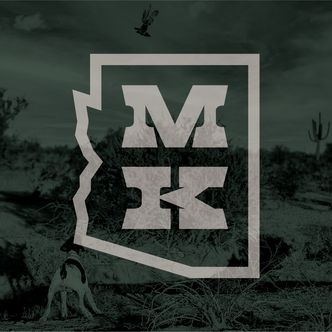
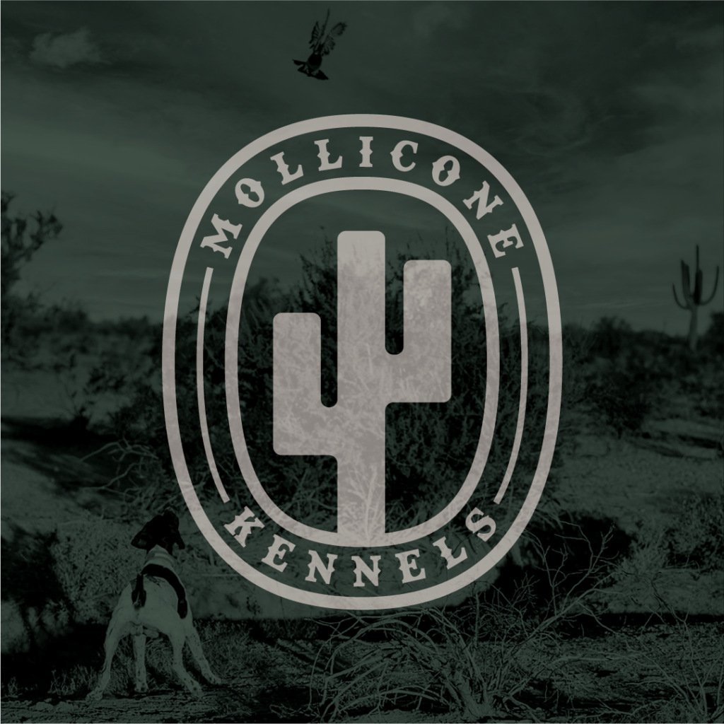
The final brand included both a typographical wordmark and an Arizona-shaped logo. Because of it’s reputation, I knew the Mollicone name needed to be at the center of this brand. However, the name is long, leading to versatility and sizing complications.
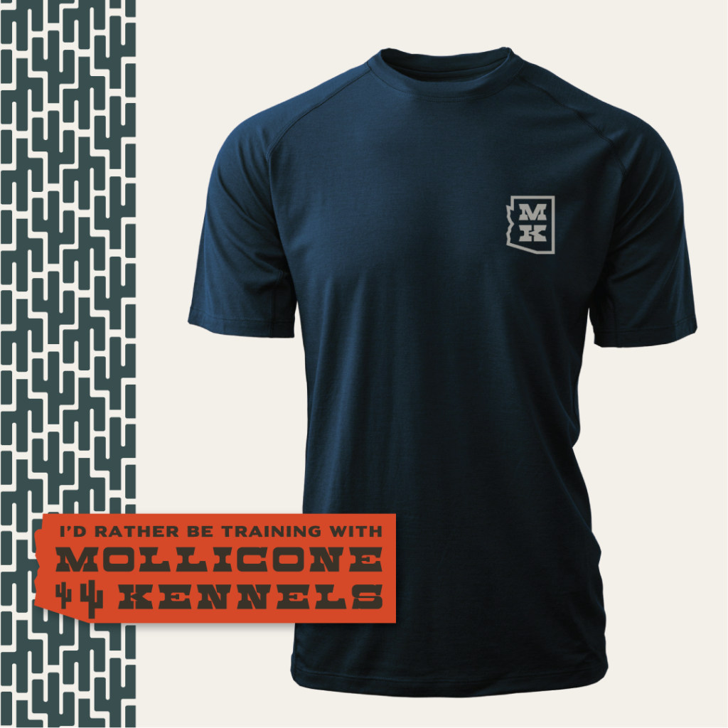
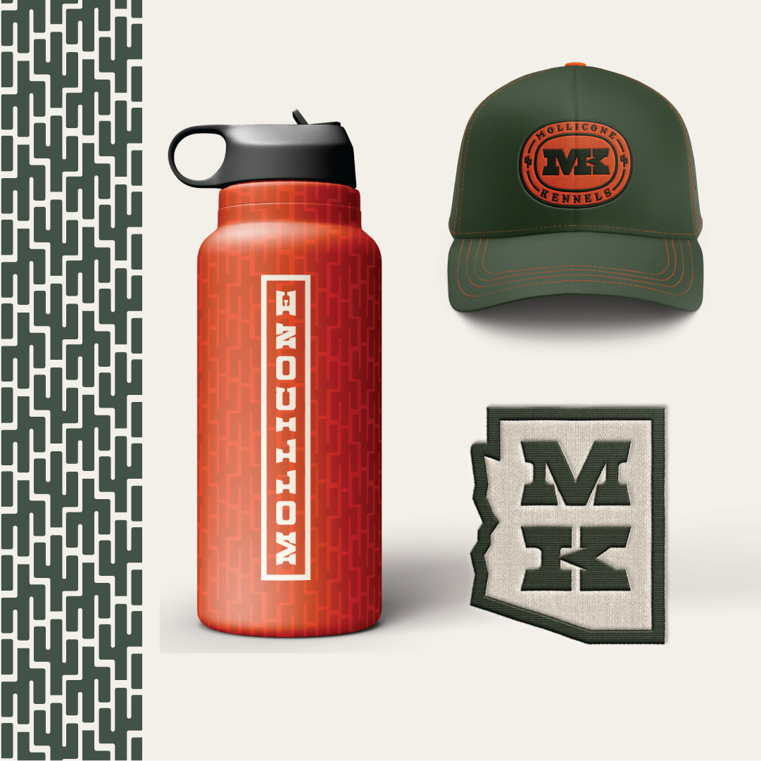
To solve this, I began utilizing the initials MK and exploring possible logo iterations. I eventually landed on the state-shaped logo which the client loved. In the process, I also developed a couple of badges that I included as a bonus deliverable. These extra badges took very little extra time, looked great on merch, and greatly added to the overall versatility of the brand.
Make it Feel Like Home.
Once the brand’s bones were in place I began exploring possible color palettes. Due to the necessity of high visibility in the field, I knew a bright orange was a must. For the rest of the pallet, I drew inspiration from the natural beauty of the Arizona landscape; pulling colors from training and hunting photos, sent over from the client. While I originally had envisioned a dusty and muted palette, the more saturated color schemes prevailed. This color saturation helped convey a level of authority and expertise synonymous with the Mollicone name, and their high-caliber training.
Lastly, I included imagery from Guy’s training grounds and property. The barren mountains and desert landscape are at the heart of Guy’s and Mollicone Kennels’ story. Including this imagery was the final touch that made the brand feel like home for Guy and his team.
Take it Online.
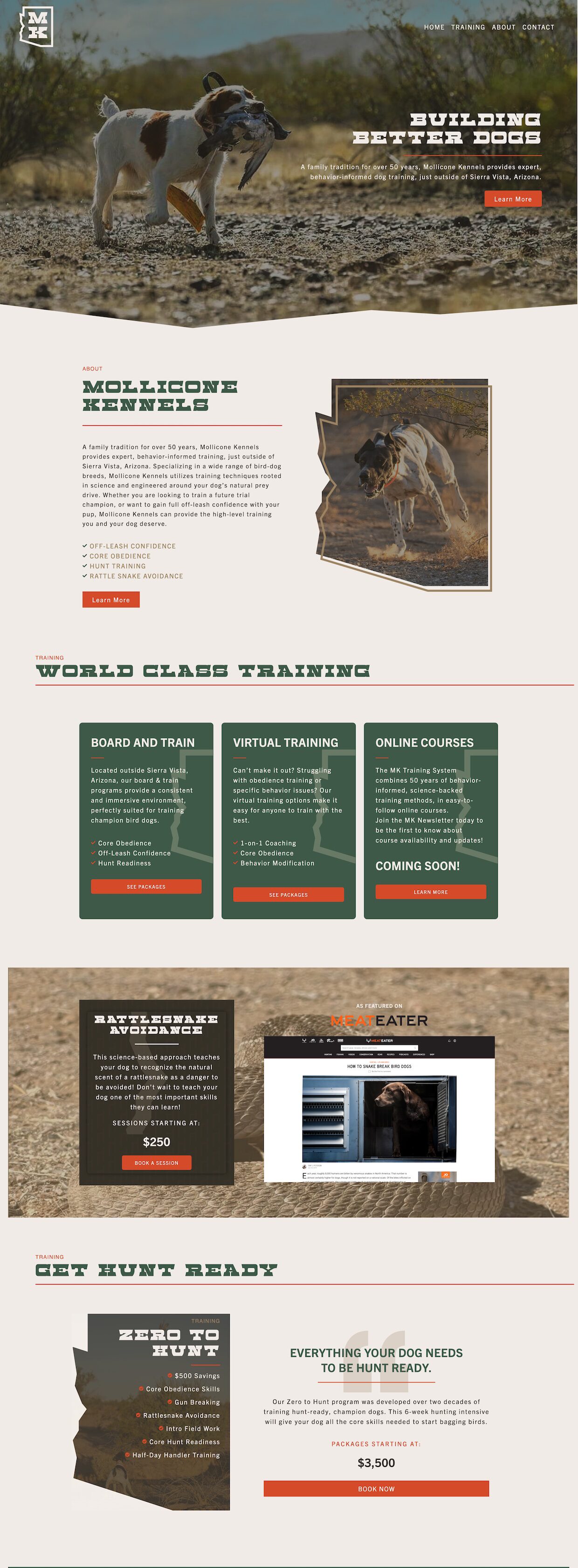
Next, I began developing the new Mollicone Kennels website. The primary objectives for the new site were:
1: Create an informative and professional online presence for Mollicone Kennels that cohesively integrates the new brand.
2. Clearly outline and display the new pricing structure.
3. Incorporate a newsletter signup to develop a contact base for current clients and generate new client leads.
The client’s love of the state-shaped logo led me to incorporate this shape language throughout the website. A lightened tone of the brand’s Traildust color swatch served as the site background, while the Grassland green created a confident and professional tone. The bright orange became the perfect accent color to highlight important elements.
A cohesive visual and structural hierarchy makes the website easy to navigate and provides easily accessible information. This was especially imperative when outlining the new pricing and services structure.
Expanding on this hierarchy I created a variety of CTA’s that promoted important elements, including the new Zero to Hunt program we developed and a newsletter opt-in form.
