Mollicone Kennels

Case Study

Mollicone Kennels

Branding | Web Design | Merch

Project Goals:

Pricing | Process | Presence

Deliverables:

Brand & Website
Pricing & Services Structure Apparel & Merch Design
Business Coaching

Timeline:

6 months

Guy Mollicone and his family have trained bird dogs in the Arizona wilderness for nearly 50 years. Where many trainers employ old-fashioned and often harmful training tactics, Mollicone Kennels utilizes a behavior-informed approach that builds happy, confident dogs. For decades, Guy has kept his kennels and waitlist full, relying on little more than word of mouth and his reputation as a trainer. Guy knew the importance of establishing a brand and online presence but, like many business owners, didn’t know where to start.

At the start of this project, Guy knew he needed, at minimum, a website created. However, as we discussed his long-term goals for Mollicone Kennels, we began to identify some key objectives and reoccurring issues.

Organizing Pricing and Services Stuctures.

Firstly, we identified that Mollicone Kennel’s services were underpriced compared to other trainers in the area, who were often less experienced and qualified. Additionally, The kennels did not have a clearly outlined or defined pricing or services structure. Pricing was all-inclusive and did not consider variables that made training more time-consuming or challenging. Factors such as difficult or aggressive dogs, training location, and even the cost of birds, all had financial impacts.

To correct this, I spent a great deal of time working with Guy to understand his training process and methodology from start to finish. Through this, I identified reoccurring client archetypes and created corresponding service tiers. This tiered system divided clients into three main groups: Basic Obedience, Intro Hunt, and Advanced Hunt. It also defined clear timelines and pricing for training deliverables.

To advance to the next tier each dog is required to have taken and passed the previous course, with an option to test out. This ensured that every dog trained received the same high-caliber programming. It also provided clients with the opportunity to select a training solution that best aligned with their long-term training goals. 

We additionally developed a streamlined training intensive specifically designed for folks looking to develop a “green” or hunt-ready dog, but not necessarily looking to enter trails or competitive hunts. This “Zero to Hunt” program extends the typical training block by two weeks and includes all the deliverables from the Basic Obedience and Intro to Hunt tiers. 

Guy could simultaneously raise his prices while also providing more accessible training options. 


Branding to Caliber.

Next, we discussed Mollicone Kennel’s digital presence and overall brand. In short, we agreed that the Kennels needed a brand and web presence that reflected the caliber of work they’ve been doing for decades. Guy wanted to begin creating training content but first, needed to establish a foundational online presence.

The branding was the easy part. I’ve known Guy for years, and the relational equity between us helped make creating this brand a breeze.

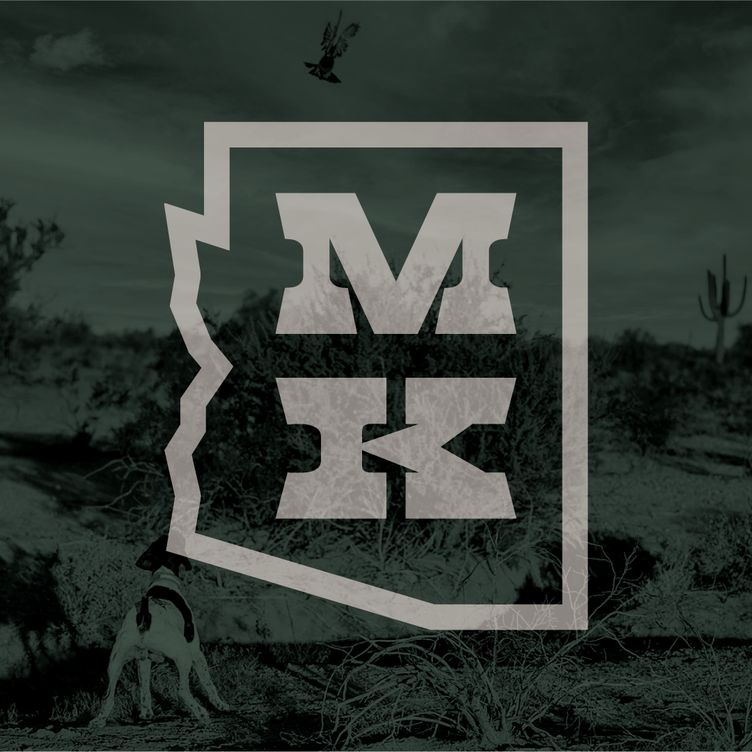
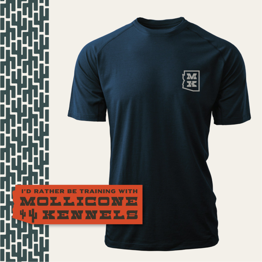
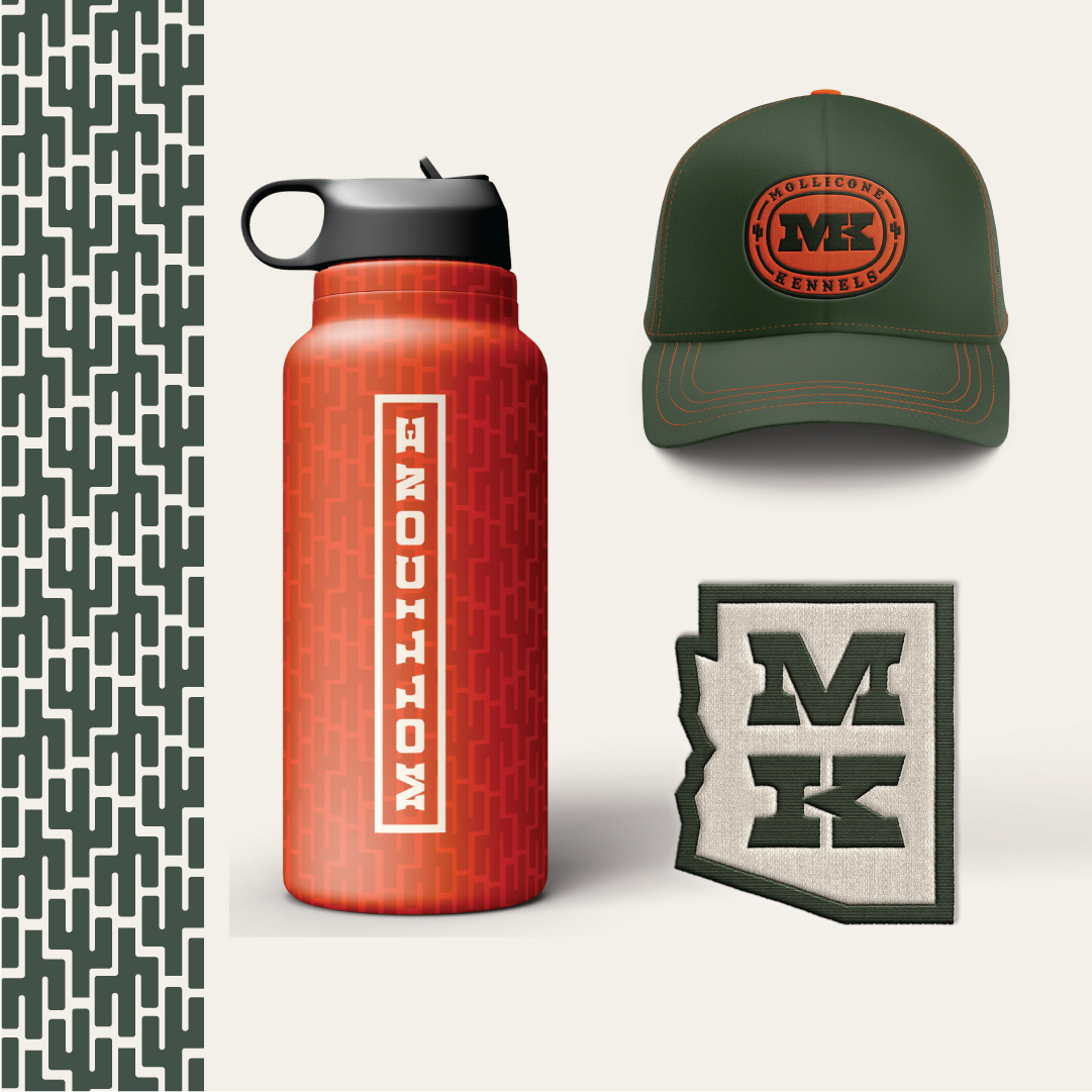
The final brand included both a typographical wordmark and an Arizona-shaped logo. Because of it’s reputation, I knew the Mollicone name needed to be at the center of this brand. However, the name is long, leading to versatility and sizing complications.


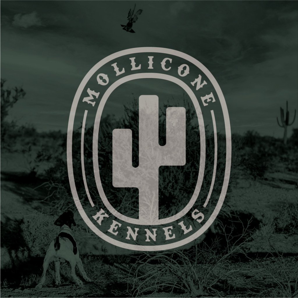
To solve this, I began utilizing the initials MK and exploring possible logo iterations. I eventually landed on the state-shaped logo which the client loved. In the process, I also developed a couple of badges that I included as a bonus deliverable. These extra badges took very little extra time, looked great on merch, and greatly added to the overall versatility of the brand.

Make it Feel Like Home.

Once the brand’s bones were in place I began exploring possible color palettes. Due to the necessity of high visibility in the field, I knew a bright orange was a must. For the rest of the pallet, I drew inspiration from the natural beauty of the Arizona landscape; pulling colors from training and hunting photos, sent over from the client. While I originally had envisioned a dusty and muted palette, the more saturated color schemes prevailed. This color saturation helped convey a level of authority and expertise synonymous with the Mollicone name, and their high-caliber training.

Lastly, I included imagery from Guy’s training grounds and property. The barren mountains and desert landscape are at the heart of Guy’s and Mollicone Kennels’ story. Including this imagery was the final touch that made the brand feel like home for Guy and his team.

Take it Online.

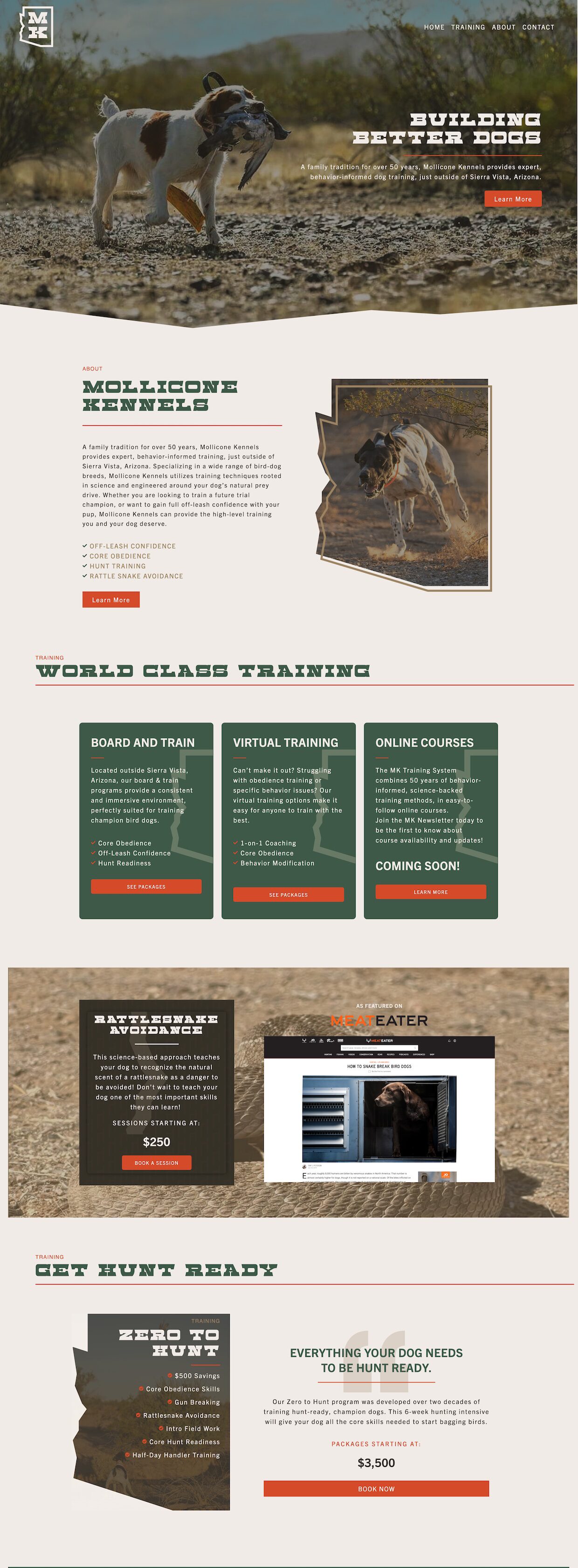
Next, I began developing the new Mollicone Kennels website. The primary objectives for the new site were:

1: Create an informative and professional online presence for Mollicone Kennels that cohesively integrates the new brand.

2. Clearly outline and display the new pricing structure.

3. Incorporate a newsletter signup to develop a contact base for current clients and generate new client leads.

The client’s love of the state-shaped logo led me to incorporate this shape language throughout the website. A lightened tone of the brand’s Traildust color swatch served as the site background, while the Grassland green created a confident and professional tone. The bright orange became the perfect accent color to highlight important elements.

A cohesive visual and structural hierarchy makes the website easy to navigate and provides easily accessible information. This was especially imperative when outlining the new pricing and services structure.

Expanding on this hierarchy I created a variety of CTA’s that promoted important elements, including the new Zero to Hunt program we developed and a newsletter opt-in form.

CFSWW Moving Mountains

Moving Mountains

Community Foundation of Southwest Washington

for the community.

Every year the non-profit CFSWW hosts a large fundraising event that celebrates their successes over the past year, and highlights their goals for the upcoming year. While working at Blue Blazes, I was tasked with creating a visual identity and event specific branding centered around the theme “Moving Mountains”.

strength in simplicity.

This event-specific branding was kept clean and simple to ensure it blended cohesively with the existing CFSWW branding. The main logo contains two custom built “m’s” inside a square frames. This represented the event initials and the mountains themselves. A calming yet confident color palette created a cohesive feel to the event branding.

Greenberry Website

GreenBerry

Art Direction | Web Design

New Construction

Greenberry is a general fabricator and contractor with nearly five decades of experience. Greenberry has worked on projects throughout the U.S. and in numerous industries. After our team completed a brand refresh, I designed a cohesive homepage and interior page for their new site. These pages provided art direction and served as a template for future pages.

Precision Details

I incorporated a faint gridded background to add depth and texture to each page. The grids represented the graphing paper many of the engineers used daily. Additionally, I utilized circular rings and subtle linework to bring in elements from the newly refreshed brand.

Bri Johns

Bri Johns

Creative Direction | Branding | Web Design

Getting Personal

Bri Johns is a professional public speaker and writer, speaking at women’s conferences and youth camps across the country. Bri, a longtime friend, approached me needing a personal brand and website. I wanted to create a brand that represented her creatively and professionally. I additionally wanted it to mirror her friendly and approachable nature as a writer and public speaker.

Be Intentional

The free-form circle throughout the brand adds a fun and versatile creative element while subtly representing deeper symbolic elements. One of my favorite things about Bri is her ability to embrace, celebrate, and transparently share her struggles and imperfections. The intentional use of this shape language symbolizes these personal characteristics. The shape is also a subtle nod to a speech bubble and represents her work as a speaker and writer.

Clean and Simple

The website is a cohesive extension of the brand. It highlights Bri’s past work and allows potential clients to contact her. Large speaking images help elevate the professional and approachable tone established by the brand’s color palette and typography.

Luna Gifs

Luna Gifs

ANIMATION | GIFS

Gif me baby.

These cute lil bots were created for Orange Nebula to be used on Giphy and the larger web. These simple emotes were first vectorized in Illustrator, then animated in After Effects, and finally exported through Photoshop. Always excited for the opportunity to do some annimation work!

Crystal Core Fitness

Crystal Core Fitness

Creative Direction | Branding | Web Design

Fitness for all.

Crystal approached me, needing a brand and website for her new personal training business. During our initial conversations, she discussed the importance of her brand feeling accessible and enjoyable. Crystal referenced how fitness brands often felt exclusionary and unapproachable. In contrast, however, she did like the professional and high-end feel of some of those same brands.

The Crystal Core logomark is a series of outlined half-circles meant to represent the weighted plates affixed to the end of barbells. The parted and enclosed rings also create a series of letter C’s representing Crystal Core. These natural repeating shapes within the logomark lent themselves to several uses throughout the brand, including patterns and overlays.

Perfect Imperfections.

To create a more body-positive and inclusive brand, I intentionally made the circular shape of the logo imperfect, with a width greater than its height. I also utilized fun wavy linework, bright colors, and offset images. This shape language became a subtle pushback against fitness brands that promoted a singular “perfect” body type within their branding. I created the tagline “Fitness for All” to help further connect these thematic elements that inevitably became a central selling point for the client.

Lastly, I created mockups for the final brand presentation to help the client visualize her brand in different real-world applications. These mockups included image overlays, printed and digital materials, and apparel.

KnightCode

Case Study

Knight Code

Creative Direction | Card Design | Packaging Design

KnightCode
To Go:

Client trust is invaluable. Consistency builds creativity.
Effectively communicate inspiration.

The KnightCode team approached us to help bring creative vision to their newest project, a card-sorting game to help families identify their core values and identity. They had already developed the gameplay mechanics and content but needed a robust visual design system to bring this project to life.

The game cards comprised 100 descriptive words, each visually represented by a custom icon. Our first task was to create a singular creative direction for the iconography style. Utilizing mood boards, we opted for a clean monoline style.

Testing, Sketchy Shit, Manic Artboards

Due to the large number of icons, we had to ensure each icon fit cohesively with the rest of the set. To test this, we created a sample set of 5 icons to gauge how well they work together stylistically. We quickly realized that the circular framing around each icon significantly contributed to a uniform look and feel amongst the icons. Once the sample set was approved, I spent the next eight months crafting the remaining 90 icons. We went intentionally slow, building only one pillar (10 icons) at a time. Pacing ourselves was all about quality control and avoiding creative burnout. At the end of every pillar, we compared it to the previous one to check consistency and cohesiveness.

Each icon set began with sketches. I first looked at each pillar thematically, which greatly informed each icon. I then started with the most straightforward and recognizable representation of each term. Once I had a sketch concept I knew I could work with, I jumped into Illustrator and began vectorizing the icon.

I then continually refined the icon, sometimes to make it more visually exciting and other times to provide clarity. Icon after icon, I repeated this process. Once I had completed the set, I compared each icon to gauge how well they fit together stylistically and thematically.

After I completed each pillar, I would meet with the KnightCode team to assess and discuss any necessary changes. The pillar presentations ended up being the most reassuring part of the process. With each icon set, I developed a better understanding of the KnightCode team’s vision and quickly became able to predict their stylistic preferences. My emotional intuition and ability to connect with clients proved to be my greatest asset on this project.

Loading....100%

Finally, all 100 icons were finished and approved! It was a journey that challenged and immensely strengthened my creative problem-solving abilities. But we still had work to do. Next, I had to design the physical game cards that displayed each icon. We decided on a hexagonal card shape early in the icon development process. We would feature the card’s icon and associated word on one side. The opposite side would highlight the icon’s word, phonetic pronunciation, and description. One of the primary challenges for the card design was displaying the icon on the back. I quickly realized that keeping the icon black and white helped with visibility and contrast. However, this made the icon side of the card feel flat and uninteresting. To fix this, I created a unique geometric background pattern. I also utilized a vignette shadow to provide depth and luminosity to the background.
For the definition side, I applied a smaller, pillar-specific, patterned background and darker shadowing to provide texture and depth to the card. For the color palette, I focused on warm yet vibrant colors. Each pillar was then assigned a specific color and unique background pattern. An overlayed crossbar created the perfect contrasting section to display the card title. Finishing touches included adding a smaller version of the icon to the top of the card and some gradient line-work.
And now we’re here! KnightCode is currently working on prototyping and production of the cards. If you’ve read this far, thank you! Designing these cards utilized all of my creative skills and is one of my favorite projects to date. Most importantly, it showed me the importance of developing strong client relationships and the value of a client’s trust. On to the next one.

Cardinal Knives

Cardinal Knives

NAMING | BRANDING | PACKAGING

What's in a name?

Cardinal Knives was an early naming and branding contender for Acre Knives. “Cardinal” refers to the cardinal points on a compass and conveys confidence, expert knowledge, and an entrepreneurial spirit. It represented new beginnings for a team of experienced bladesmiths positioning themselves as expert guides to anyone looking for a quality knife.

Stay sharp.

While the name Cardinal didn’t stick, many of its sharper elements did and can be seen throughout the final Acre brand. Unique to the Cardinal brand was an octagonal shape that served as a primary logomark. I utilized this octagon throughout the brand in many of the same ways the Acre hexagon was incorporated. Additionally, a star-shaped pattern mimics the cut of a knife and refers back to the navigation motifs of the Cardinal name.

Allplay

allplay

NAMING | BRANDING | PACKAGING

All in a name.

Before they were Allplay, they were boardgametables.com. While they did sell tables, they also sold many other gaming products and accessories. However, the specificity of their original name left many potential customers confused and unaware of the company’s other products. Our first task was to find an inviting, consumer-friendly name that accurately reflected the company’s robust products.

“Allplay” comes from a commonly used gaming term that invites each player to participate in the current turn. We chose this name precisely because of its wide usage within board games and familiarity amongst novice and experienced gamers. The name directly contrasts many of Allplay’s competitors, who often use niche terminology and branding that mainly appeals to a specific audience. As described by the Allplay team, “We want to move away from the bearded guy in his basement stereotype”

Don't forget to play

While part of our team pursued a more polished and refined name and branding direction, I decided to explore a fun and playful alternative. It was from this exploration that Allplay was born! A custom geometric wordmark quickly became the primary logo for this brand. Its simplicity allowed us to effectively apply the mark to game boxes, bags, tables, and more. The playful letterforms and dramatic drop shadow add a unique and approachable feel. A fun but professional color palette adds vibrancy and liveliness to the overall brand. Additionally, we utilized a series of rounded corners, straight edges, and drop shadows throughout the brand to complement the shape language found within the wordmark.

Cookie Society

Cookie Society

BRANDING | PACKAGING

Build for where they're going.

When Cookie Society approached us for branding work, they were a small mail-order cookie business. Their main ask was to develop a whimsical but professional brand they could grow with. Today, they have a thriving online business, two brick-and-mortar locations, an event truck, and nationwide acclaim. The Cookie Society brand is a testament to the importance of building a foundationally strong branding system that can grow and expand as your clients do.

Lovin' Every Crumb.

One of my favorite brand taglines that I have created is Cookie Society’s “Lovin’ Every Crumb”. This play on words represents the baker who puts love into every crumb and the consumer who is “lovin’ every crumb”.

Keep it simply sweet.

As this brand has grown, the foundational simplicity of its design has allowed it to remain cohesive and true to its origin. The simple rectangular frame is a nod to their original boxes and their start as a mail-order cookie service. The geometric typography with circular “o’s” and “c’s” represent the cookies. A beautiful pop of teal adds personality and approachability to the overall brand. Sweet. Simple.